
About
A button with a global keyboard shortcut, shown as keycaps that sink as you hold each key. Original Evil Buttons source, published with its Apache-2.0 license.
Built with React and Tailwind. Copy the prompt and paste it into Claude Code, Cursor or Lovable: your agent adds CommandButton to your project and fits it to your theme.
Code
How CommandButton is used: the demo's code. The component's own source comes with a free account.
Usage.tsx
import { useState } from "react";
import Component from "@/components/ui/evilbuttons-command-button";
export default function Demo(){const [done,setDone]=useState(false);return <div data-component-demo className="dark flex min-h-screen w-full flex-col items-center justify-center gap-6 bg-neutral-950 px-6 text-white"><Component onCommand={() => setDone(true)} /><p role="status">{done ? "Action triggered locally" : ""}</p></div>;}
More by jay sharma
View all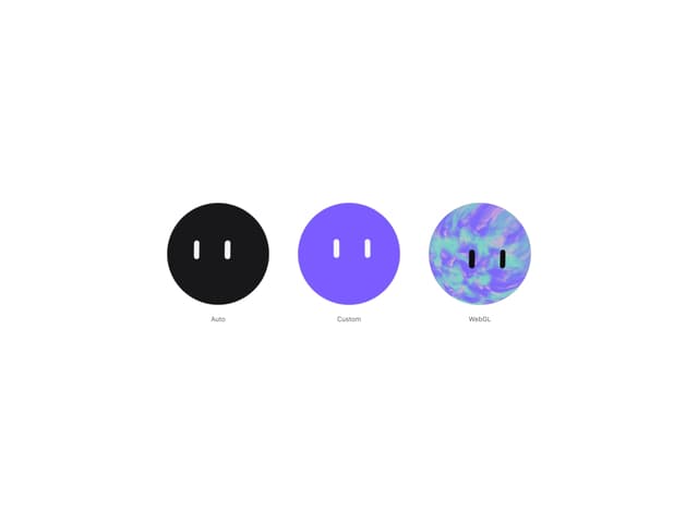

Live Orb
354
Chrome Button
184
Frame Button
133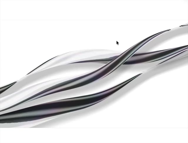
Shader Metal
88
Highlight Button
81
ASCII Fluid
76
Brutal Button
64
Motion Button
61
More in Buttons
View all

Button
5
Texture Button
97

Button Group


Eclipse Button
39
Button
4

HeroUI Button Group

Base Button
4

App Store Button
458

