
About
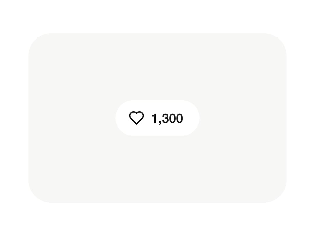
Press the heart and it pops with a burst while the count rolls up a digit.
Built with React and Tailwind. Copy the prompt and paste it into Claude Code, Cursor or Lovable: your agent adds Like to your project and fits it to your theme.
Code
How Like is used: the demo's code. The component's own source comes with a free account.
Usage.tsx
import { Like } from "@/components/ui/like-button";

const settings = {
  color: "Red",
  effect: "Bloom",
  burst: 50,
  corner: 22,
};

export default function Demo(props: Partial<typeof settings>) {
  const s = { ...settings, ...props };
  return (
    <div className="flex min-h-screen w-full items-center justify-center bg-white dark:bg-black">
      <div className="flex items-center justify-center rounded-[28px] bg-[#f7f7f6] p-10 dark:bg-[#0a0a0a]">
        <Like {...s} />
      </div>
    </div>
  );
}
Dependencies
More in Buttons
View all

Button
1
Texture Button
97

Eclipse Button
39

App Store Button
458

HeroUI Button Group
2
Button
4

Button
65
Button
68


