
About
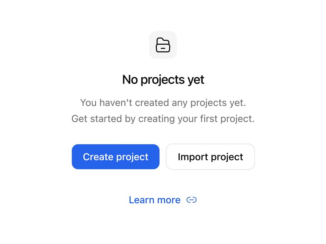
An empty-state placeholder with an icon, title, description and action buttons for showing "no data yet" screens like empty project lists.
Built with React and Tailwind. Copy the prompt and paste it into Claude Code, Cursor or Lovable: your agent adds Empty Card to your project and fits it to your theme.
Code
How Empty Card is used: the demo's code. The component's own source comes with a free account.
Usage.tsx
import EmptyCard from "@/components/ui/empty-card";

export default function EmptyCardDemo() {
  return (
    <div className="flex w-full items-center justify-center p-8">
      <EmptyCard />
    </div>
  );
}
Dependencies
More by uiable
View all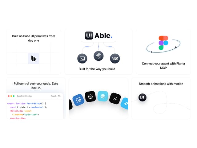

Feature Highlights Grid
388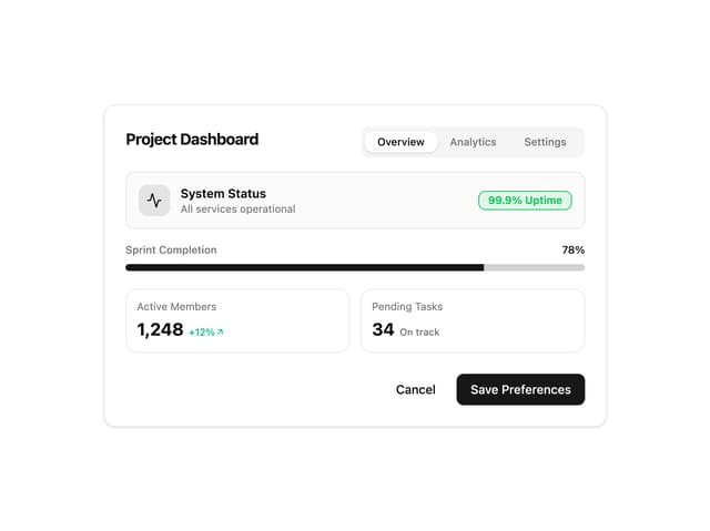
Card Tabs
109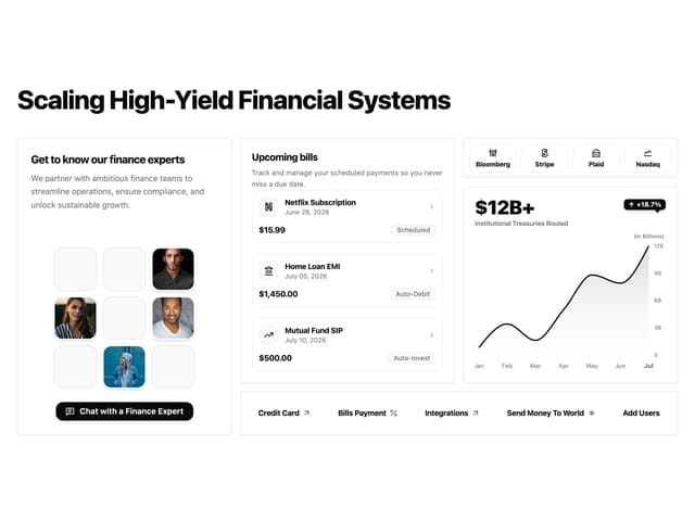
Financial Bento Grid
85
Chart Tooltip
72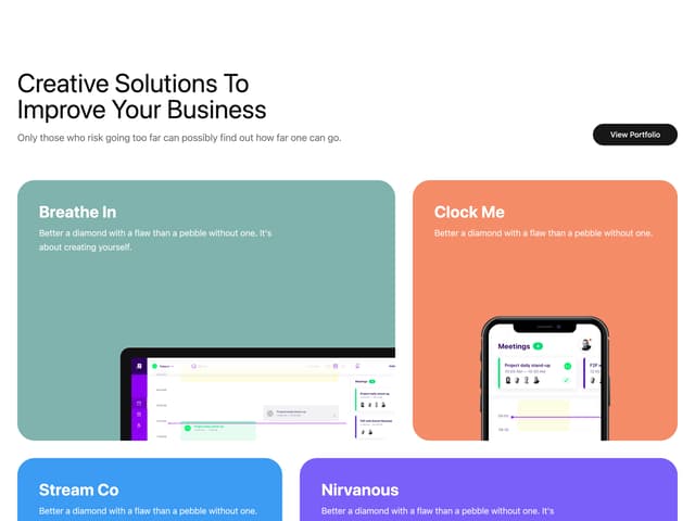
Portfolio Showcase Grid
68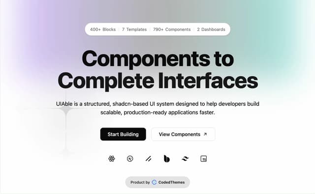
Marketing Hero Section
64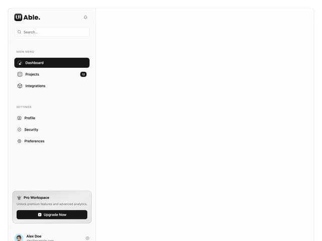
Sidebar with Search and Profile
54
Position Sonner
48
More in Cards
View all

Course Design Cards
1.1K

Statistics Card 7
301
Statistics Card 2
272
Stats cards with links
82

Interactive Tech Stack Bento Grid with Hover Effects
183

Card Studio
35
Card
70

Card
18
