About
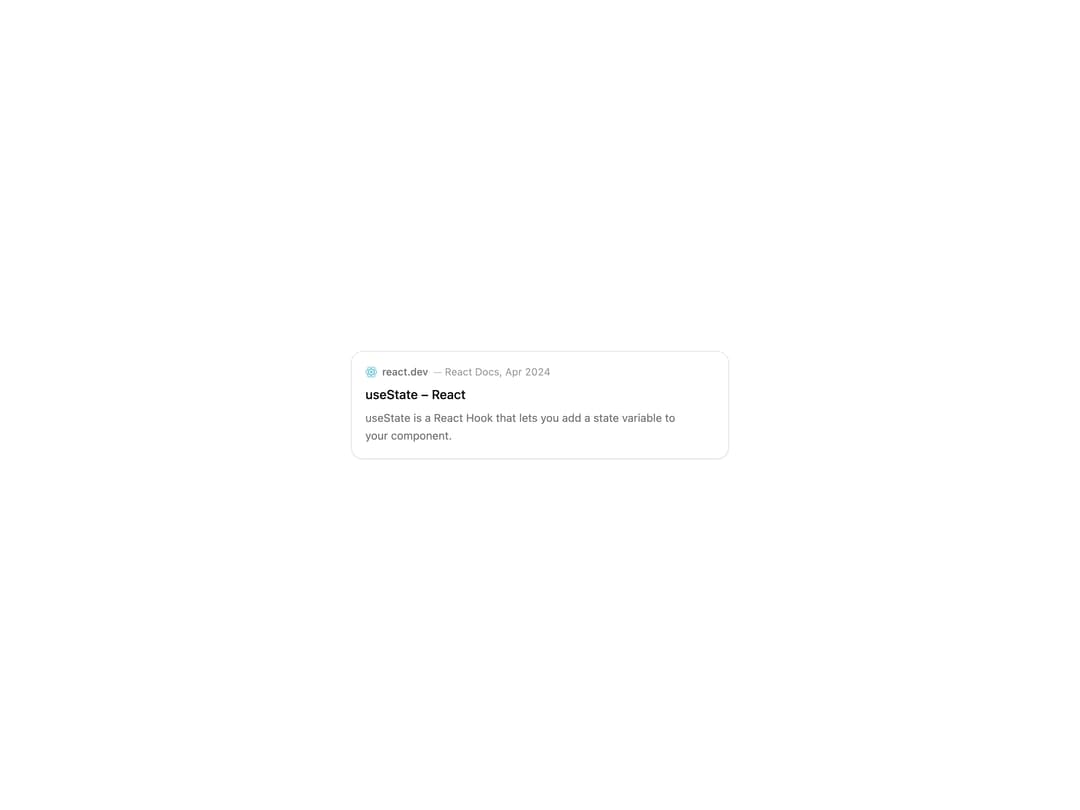
Displays a source reference card with title, domain, favicon, author, and text snippet for citing external sources, with default, inline, and stacked list variants.
Built with React and Tailwind. Copy the prompt and paste it into Claude Code, Cursor or Lovable: your agent adds Citation to your project and fits it to your theme.
Code
How Citation is used: the demo's code. The component's own source comes with a free account.
Usage.tsx
import { Citation } from "@/components/ui/citation";

export default function CitationDemo() {
  return (
    <div className="flex min-h-[320px] w-full items-center justify-center p-6">
      <Citation
        id="citation-example"
        href="https://react.dev/reference/react/useState"
        title="useState – React"
        snippet="useState is a React Hook that lets you add a state variable to your component."
        domain="react.dev"
        favicon="https://www.google.com/s2/favicons?domain=react.dev&sz=32"
        author="React Docs"
        publishedAt="2024-04-25T00:00:00.000Z"
        type="document"
      />
    </div>
  );
}
Dependencies
More by tool-ui
View all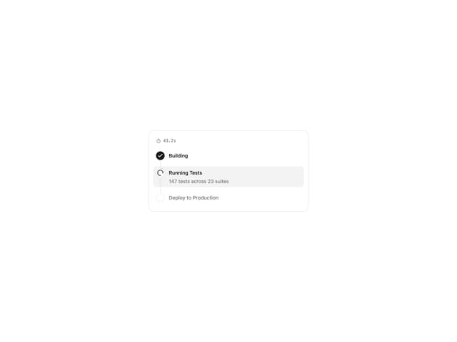
Progress Tracker
11
Message Draft
9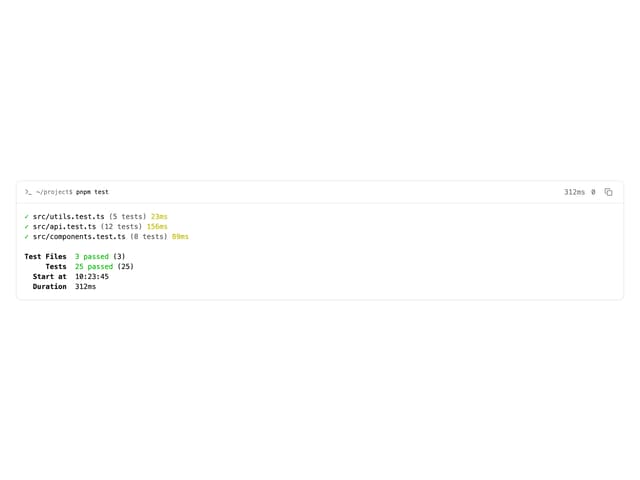
Terminal
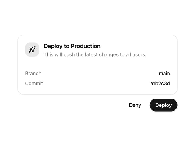
Approval Card
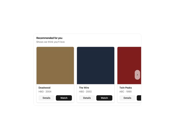
Item Carousel
More in Cards
View all

Course Design Cards
1.1K

Statistics Card 7
301
Statistics Card 2
272
Stats cards with links
82

Interactive Tech Stack Bento Grid with Hover Effects
183

Card Studio
35
Card
70

Card
18
