
About
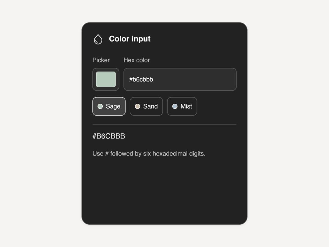
A hex color text field with preset swatches and a popup color picker (saturation/brightness plane plus hue, saturation and brightness sliders), ported from the SL UI Library's vanilla JS/HTML "inputs-color-v11" component (MIT, by SLtowl) to a single React component.
Built with React and Tailwind. Copy the prompt and paste it into Claude Code, Cursor or Lovable: your agent adds Matte Color Input to your project and fits it to your theme.
Code
How Matte Color Input is used: the demo's code. The component's own source comes with a free account.
Usage.tsx
"use client";

import ColorInput from "@/components/ui/matte-inputs-color-v11";

export default function ColorInputDemo() {
  return (
    <div className="flex min-h-screen w-full items-center justify-center bg-[#f5f4f2] p-6">
      <ColorInput />
    </div>
  );
}
More by sltowl
View all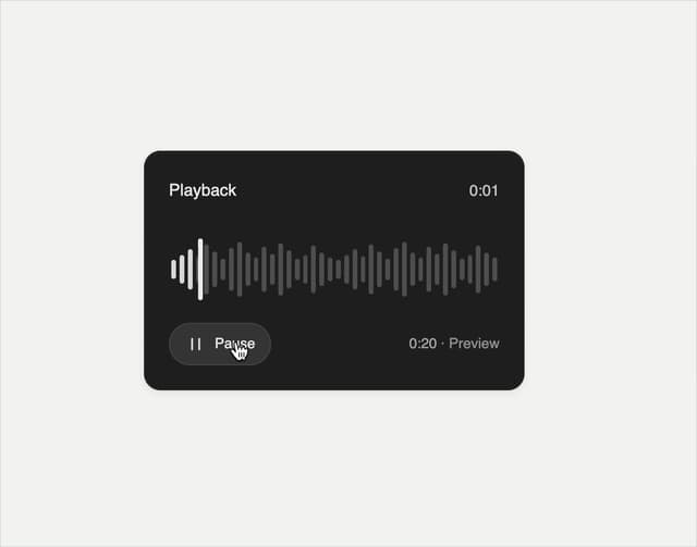
Playback Scrubber
48
Matte Alert Feedback
43
Notification Stack
32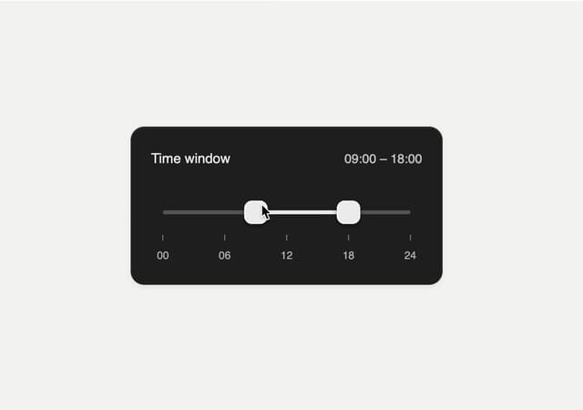
Time Window Slider
21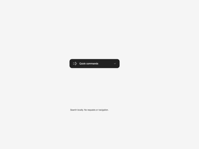
Commands Menu
15
Matte Meter Slider
15
Matte Opacity Slider
13
Undo Feedback
8
More in Forms
View all

Premium Auth
524

Contact Card
1K

Book A Demo 1
73

Form
16

Login 1
53
Book A Demo 3
89
Hand-Drawn Checkbox
48
Login Card
6

