
About
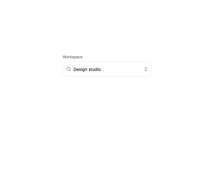
A searchable, keyboard-navigable select combobox with a sliding highlight that glides between options and a popover panel that springs open from its trigger.
Built with React and Tailwind. Copy the prompt and paste it into Claude Code, Cursor or Lovable: your agent adds Motion Combobox to your project and fits it to your theme.
Code
How Motion Combobox is used: the demo's code. The component's own source comes with a free account.
Usage.tsx
import {
  Combobox,
  ComboboxContent,
  ComboboxEmpty,
  ComboboxGroup,
  ComboboxInput,
  ComboboxItem,
  ComboboxLabel,
  ComboboxList,
  ComboboxSeparator,
  ComboboxTrigger,
} from "@/components/ui/motion-combobox";
import { Blocks, Box, Component, Layers3 } from "lucide-react";
import { useState } from "react";

const WORKSPACES = [
  {
    value: "studio",
    label: "Design studio",
    detail: "12 projects",
    group: "Recent",
    icon: Component,
    color: "bg-amber-400/20 text-amber-700 dark:text-amber-300",
  },
  {
    value: "product",
    label: "Product team",
    detail: "8 projects",
    group: "Recent",
    icon: Layers3,
    color: "bg-sky-400/20 text-sky-700 dark:text-sky-300",
  },
  {
    value: "playground",
    label: "Playground",
    detail: "24 experiments",
    group: "Workspaces",
    icon: Blocks,
    color: "bg-emerald-400/20 text-emerald-700 dark:text-emerald-300",
  },
  {
    value: "archive",
    label: "Component archive",
    detail: "41 components",
    group: "Workspaces",
    icon: Box,
    color: "bg-rose-400/20 text-rose-700 dark:text-rose-300",
  },
] as const;

function WorkspaceMark({ value }: { value: string }) {
  const workspace = WORKSPACES.find((item) => item.value === value);
  if (!workspace) return null;
  const Icon = workspace.icon;
  return (
    <span
      className={`grid size-7 shrink-0 place-items-center rounded-lg ${workspace.color}`}
    >
      <Icon className="size-3.5" />
    </span>
  );
}

export function ComboboxPreview() {
  const [value, setValue] = useState("studio");

  return (
    <div className="w-full max-w-72">
      <p className="mb-2 text-xs font-medium text-muted-foreground">
        Workspace
      </p>
      <Combobox value={value} onValueChange={setValue}>
        <ComboboxTrigger className="h-12 rounded-2xl px-2.5">
          <ComboboxInput
            aria-label="Search workspaces"
            placeholder="Search workspaces…"
          />
        </ComboboxTrigger>

        <ComboboxContent className="w-72 rounded-2xl">
          <ComboboxList ariaLabel="Workspaces" className="p-2">
            <ComboboxEmpty>No workspaces found.</ComboboxEmpty>
            {(["Recent", "Workspaces"] as const).map((group, groupIndex) => (
              <ComboboxGroup key={group}>
                {groupIndex > 0 ? <ComboboxSeparator /> : null}
                <ComboboxLabel>{group}</ComboboxLabel>
                {WORKSPACES.filter((item) => item.group === group).map(
                  (workspace) => (
                    <ComboboxItem
                      key={workspace.value}
                      value={workspace.value}
                      textValue={workspace.label}
                      keywords={[workspace.detail, workspace.group]}
                      className="py-2"
                    >
                      <span className="flex min-w-0 items-center gap-2.5">
                        <WorkspaceMark value={workspace.value} />
                        <span className="min-w-0">
                          <span className="block truncate font-medium text-foreground">
                            {workspace.label}
                          </span>
                          <span className="block truncate text-xs text-muted-foreground">
                            {workspace.detail}
                          </span>
                        </span>
                      </span>
                    </ComboboxItem>
                  ),
                )}
              </ComboboxGroup>
            ))}
          </ComboboxList>
        </ComboboxContent>
      </Combobox>
    </div>
  );
}

export default ComboboxPreview;
Dependencies
More by sidiora-labs
View all
Preview Rail
5
Wave Slider
5
Icon Accordion
4
Motion Breadcrumb
2
Expandable Tabs
2
Morph Confirm
2
Not Found
1
Swap
1