

About
An image carousel grid that shows one card per breakpoint (1 on mobile, up to 4 on desktop) using aspect-ratio cards with previous/next arrow controls.
Built with React and Tailwind. Copy the prompt and paste it into Claude Code, Cursor or Lovable: your agent adds Carousel with Responsive Basis to your project and fits it to your theme.
Code
How Carousel with Responsive Basis is used: the demo's code. The component's own source comes with a free account.
Usage.tsx
import Pattern from "@/components/ui/c-carousel-4";

export default function Demo() {
  return (
    <div className="flex w-full items-center justify-center p-6">
      <Pattern />
    </div>
  );
}
More by Sean Hello
View all

3D Testimonails
3.4K
Line Charts 9
656
Alert
494
Line Charts 6
392
Area Charts 1
391
Scroll Area
376
Navigation Menu
319
Area Charts 2
318
More in Galleries
View all

Animated Gallery
1.5K
Editorial Collage Hero
458

Image Gallery
1.4K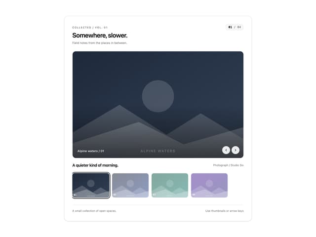
Thumbnail image viewer
64

Elastic Gallery
958
3D Parallax Unfurling Gallery
1K
Img Sphere
2.1K

Shared Element Gallery
446


