
About
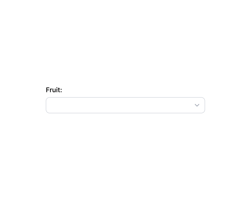
An accessible native dropdown field with a label, description, validation error, required mark and optional prefix/suffix adornments or grouped options.
Built with React and Tailwind. Copy the prompt and paste it into Claude Code, Cursor or Lovable: your agent adds Select to your project and fits it to your theme.
Code
How Select is used: the demo's code. The component's own source comes with a free account.
Usage.tsx
import Select from "@/components/ui/select";

export default function SelectGroupedDemo() {
  return (
    <div className="flex w-full max-w-sm flex-col gap-6 bg-background p-6 text-foreground">
      <Select
        label="Fruit"
        hasEmpty
        options={[
          {
            label: "Citrus",
            options: [
              { label: "Orange", value: "orange" },
              { label: "Lemon", value: "lemon" },
            ],
          },
          {
            label: "Berries",
            options: [
              { label: "Strawberry", value: "strawberry" },
              { label: "Blueberry", value: "blueberry" },
            ],
          },
        ]}
      />
    </div>
  );
}
More by robertlib
View all
Timeline
8
Spinner
3
Collapsible Content
1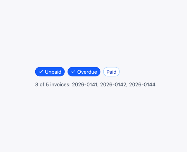
Chip
1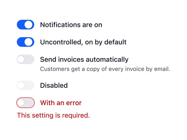
Switch
1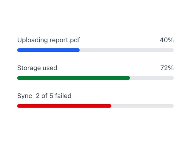
Progress Indicator
1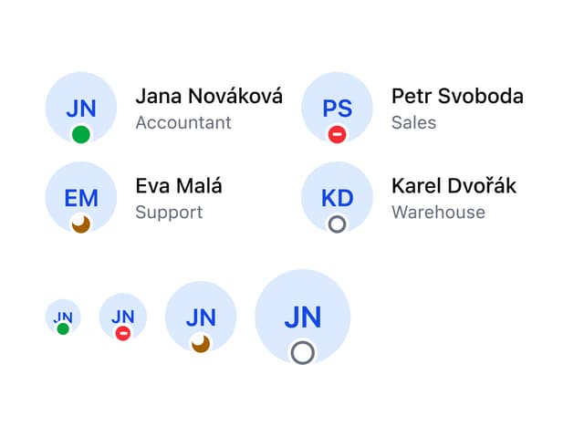
Avatar
Form Description