
About
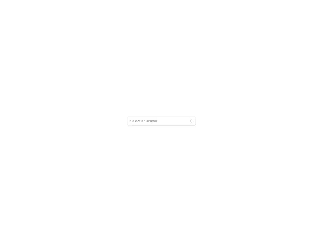
Form select rendering Select.Option components over a native select element, in controlled or uncontrolled mode. Supports a start content slot, consistent field icons, four sizes aligned with Button and TextField, faded and headless variants, error and disabled states, custom value rendering and FormControl integration.
Built with React and Tailwind. Copy the prompt and paste it into Claude Code, Cursor or Lovable: your agent adds Reshaped Select to your project and fits it to your theme.
Code
How Reshaped Select is used: the demo's code. The component's own source comes with a free account.
Usage.tsx
import { Reshaped } from "reshaped/bundle";
import Select from "@/components/ui/reshaped-select";

export default function Demo() {
  return (
    <Reshaped theme="slate">
      <div style={{ maxWidth: 320, width: "100%", margin: "0 auto", padding: 24 }}>
        <Select name="animal" placeholder="Select an animal" onChange={console.log}>
          <Select.Option value="dog">Dog</Select.Option>
          <Select.Option value="turtle">Turtle</Select.Option>
        </Select>
      </div>
    </Reshaped>
  );
}
Dependencies
More by reshaped
View all
Reshaped Toast
10
Reshaped Calendar
9
Reshaped Progress indicator
7
Reshaped Context menu
7
Reshaped Checkbox
7
Reshaped Autocomplete
7
Reshaped Pagination
6
Reshaped Carousel
6
More in Forms
View all

Contact Card
1K

Premium Auth
524

Book A Demo 1
73

Login 1
53

Form
137

Card Studio
41
SignInPage
667

Split Sign In Form
46
