About
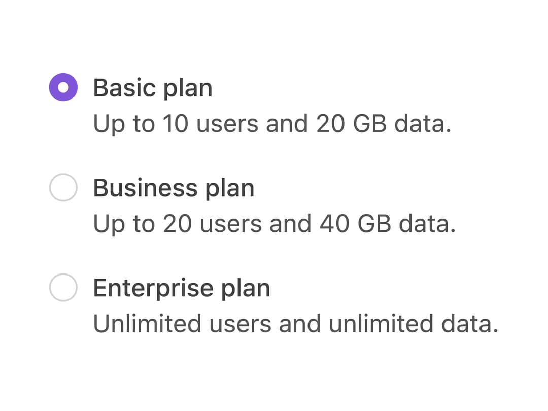
A group of radio buttons for choosing exactly one option from a small, always-visible set of mutually exclusive choices, with optional label and hint text.
Built with React and Tailwind. Copy the prompt and paste it into Claude Code, Cursor or Lovable: your agent adds Radio Buttons to your project and fits it to your theme.
Code
How Radio Buttons is used: the demo's code. The component's own source comes with a free account.
Usage.tsx
import { RadioButton, RadioGroup } from "@/components/ui/radio-buttons";

export default function RadioButtonExampleDemo() {
  return (
    <RadioGroup aria-label="Pricing plans" defaultValue="basic">
      <RadioButton
        label="Basic plan"
        hint="Up to 10 users and 20 GB data."
        value="basic"
      />
      <RadioButton
        label="Business plan"
        hint="Up to 20 users and 40 GB data."
        value="business"
      />
      <RadioButton
        label="Enterprise plan"
        hint="Unlimited users and unlimited data."
        value="enterprise"
      />
    </RadioGroup>
  );
}
Dependencies
More by properui
View all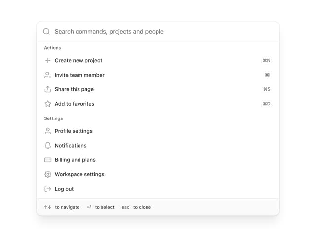

Command Menu
14
Loading Indicator
9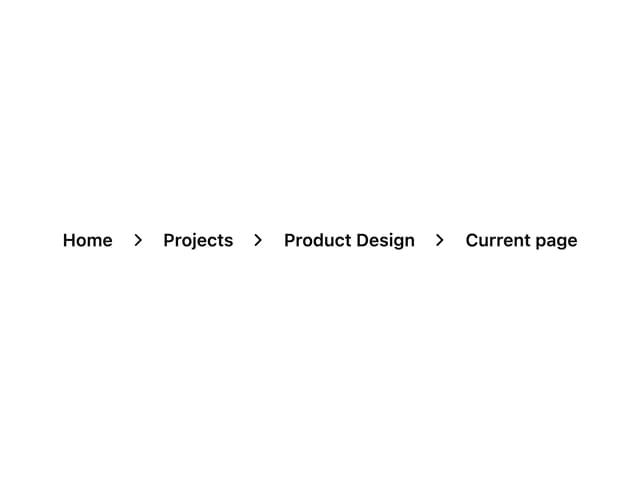
Breadcrumbs
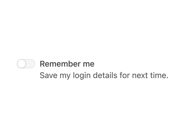
Toggle
Tags
Progress Indicators
Button
Badge
More in Pricing
View all
Pricing Section
606
pricing section
166

Pricing Section
181

Pricing Card
372

RuixenPricing05
103

Pricing Cards
17

Boxly Pricing-1
90
Colorful-Pricing
86


