
About
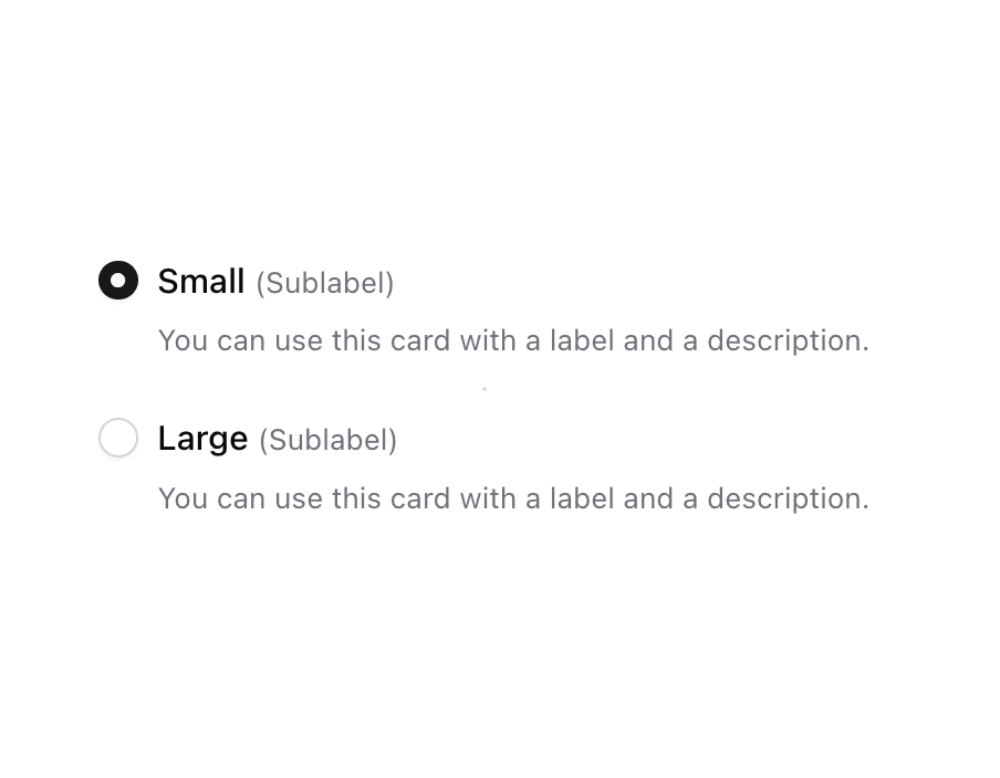
Enhanced shadcn/ui radio group
Built with React and Tailwind. Copy the prompt and paste it into Claude Code, Cursor or Lovable: your agent adds Radio Group to your project and fits it to your theme.
Code
How Radio Group is used: the demo's code. The component's own source comes with a free account.
Usage.tsx
import { Label } from "@/components/ui/label";
import { RadioGroup, RadioGroupItem } from "@/components/ui/radio-group";
import { useId } from "react";

function Component() {
  const id = useId();
  return (
    <RadioGroup className="gap-6" defaultValue="1">
      <div className="flex items-start gap-2 max-w-[400px]">
        <RadioGroupItem value="1" id={`${id}-1`} aria-describedby={`${id}-1-description`} />
        <div className="grid grow gap-2">
          <Label htmlFor={`${id}-1`}>
            Small{" "}
            <span className="text-xs font-normal leading-[inherit] text-muted-foreground">
              (Sublabel)
            </span>
          </Label>
          <p id={`${id}-1-description`} className="text-xs text-muted-foreground">
            You can use this card with a label and a description.
          </p>
        </div>
      </div>
      <div className="flex items-start gap-2 max-w-[400px]">
        <RadioGroupItem value="2" id={`${id}-2`} aria-describedby={`${id}-2-description`} />
        <div className="grid grow gap-2">
          <Label htmlFor={`${id}-2`}>
            Large{" "}
            <span className="text-xs font-normal leading-[inherit] text-muted-foreground">
              (Sublabel)
            </span>
          </Label>
          <p id={`${id}-2-description`} className="text-xs text-muted-foreground">
            You can use this card with a label and a description.
          </p>
        </div>
      </div>
    </RadioGroup>
  );
}

export { Component };
Dependencies
More by Origin UI
View all
Dialog
1.2K
Avatar
974
useImageUpload
932
usePagination
628
Popover
384
Button
367
Command
328
Calendar [React Day Picker]
265
More in Forms
View all

Premium Auth
524

Contact Card
1K

Book A Demo 1
73

Login 1
53

Form
137

Card Studio
41
SignInPage
667

Modern & Stunning sign in
1.6K
