
About
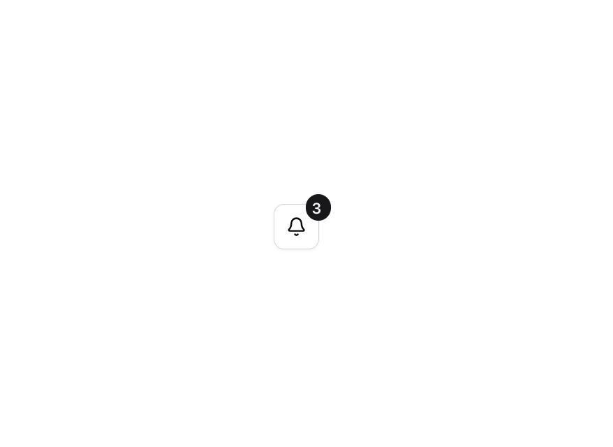
Enhanced shadcn/ui button
Built with React and Tailwind. Copy the prompt and paste it into Claude Code, Cursor or Lovable: your agent adds Button to your project and fits it to your theme.
Code
How Button is used: the demo's code. The component's own source comes with a free account.
Usage.tsx
"use client";

import { Badge } from "@/components/ui/badge";
import { Button } from "@/components/ui/button";
import { Bell } from "lucide-react";
import { useState } from "react";

function Component() {
  const [count, setCount] = useState(3);

  const handleClick = () => {
    setCount(0);
  };

  return (
    <Button
      variant="outline"
      size="icon"
      className="relative"
      onClick={handleClick}
      aria-label="Notifications"
    >
      <Bell size={16} strokeWidth={2} aria-hidden="true" />
      {count > 0 && (
        <Badge className="absolute -top-2 left-full min-w-5 -translate-x-1/2 px-1">
          {count > 99 ? "99+" : count}
        </Badge>
      )}
    </Button>
  );
}

export { Component };
Dependencies
More by Origin UI
View all
Dialog
1.2K
Avatar
974
useImageUpload
932
usePagination
628
Popover
384
Command
328
Calendar [React Day Picker]
265
Accordion
260
More in Buttons
View all
Texture Button
97

Button
5

Button Group


Eclipse Button
39
Button
4

HeroUI Button Group


App Store Button
458
Base Button
4

