
About
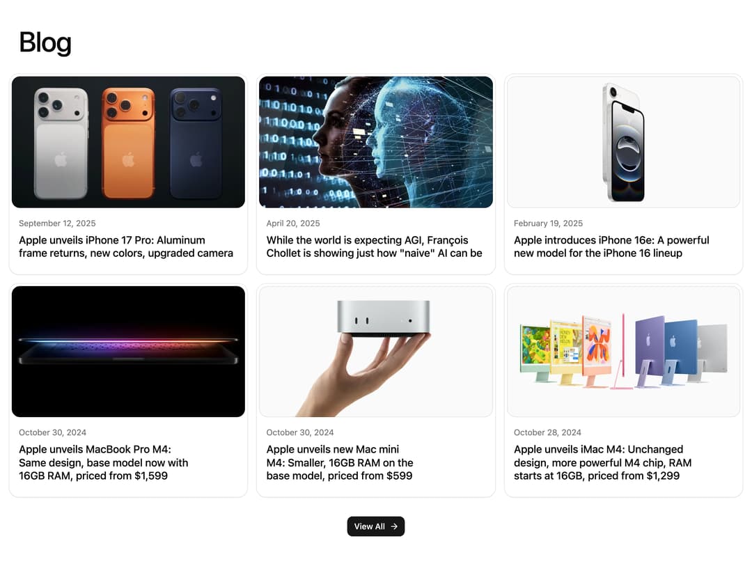
A marketing blog section that lists article cards with a cover image, publish date, and title in a responsive grid, with a view-all button below.
Built with React and Tailwind. Copy the prompt and paste it into Claude Code, Cursor or Lovable: your agent adds Blog Grid Section to your project and fits it to your theme.
Code
How Blog Grid Section is used: the demo's code. The component's own source comes with a free account.
Usage.tsx
import Blog01 from "@/components/ui/blog-01";

export default function Blog01Demo() {
  return <Blog01 />;
}
Dependencies
More by Chánh Đại
View all
Apple Hello Effect
620
Theme Switcher
247
Hero Golden Spiral
101
Mobius Loop Icon
73
Wheel Picker
71
Testimonial 2
33
Glow Card Grid
29
Spinning Circular Text
23
More in Cards
View all

Course Design Cards
1.1K

Statistics Card 7
301
Statistics Card 2
272
Stats cards with links
82

Interactive Tech Stack Bento Grid with Hover Effects
183

Card Studio
35
Card
70

Card
18
