
About
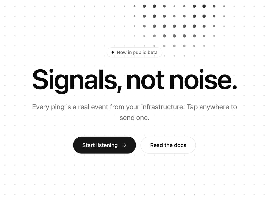
Interactive dot-grid background for hero and footer sections: sonar rings expand where you tap, ambient pings keep it alive, and one ring is already mid-flight at first paint. Canvas, zero deps, theme primary color, still under reduced motion.
Built with React and Tailwind. Copy the prompt and paste it into Claude Code, Cursor or Lovable: your agent adds Sonar Grid to your project and fits it to your theme.
Code
How Sonar Grid is used: the demo's code. The component's own source comes with a free account.
Usage.tsx
"use client"

import { ArrowRight } from "lucide-react"
import { motion, useReducedMotion } from "motion/react"
// Relative import on purpose: the 21st CLI rewrites it to the published path (`@/components/ui/<slug>`)
// and to a temporary path during `21st render`. An absolute "@/…" import breaks the render build.
import { SonarGrid } from "@/components/ui/sonar-grid"

// Module-level `settings` + a default export that accepts them as props gives this
// demo a live controls panel on 21st.dev. Signature knobs first, then look, then copy.
const settings = {
  ringWidth: 90,
  speed: 260,
  amplitude: 2.2,
  pingEvery: 2.4,
  interactive: true,
  spacing: 26,
  baseOpacity: 0.28,
  useThemeColor: true,
  color: "#6366f1",
  eyebrow: "Now in public beta",
  headline: "Signals, not noise.",
  subline: "Every ping is a real event from your infrastructure. Tap anywhere to send one.",
}

export default function Demo(props: Partial<typeof settings>) {
  const s = { ...settings, ...props }
  const reduce = useReducedMotion()
  const enter = (delay: number) =>
    reduce
      ? {}
      : {
          initial: { opacity: 0, y: 14, filter: "blur(6px)" },
          animate: { opacity: 1, y: 0, filter: "blur(0px)" },
          transition: { duration: 0.6, delay, ease: [0.22, 1, 0.36, 1] as const },
        }

  return (
    <SonarGrid
      id="sonar-grid-demo"
      ringWidth={s.ringWidth}
      speed={s.speed}
      amplitude={s.amplitude}
      pingEvery={s.pingEvery}
      interactive={s.interactive}
      spacing={s.spacing}
      baseOpacity={s.baseOpacity}
      color={s.useThemeColor ? undefined : s.color}
      pingArea={[0.22, 0.18, 0.78, 0.82]}
      className="bg-background flex min-h-[max(560px,100svh)] w-full flex-col"
    >
      {/* A soft wash behind the copy keeps it legible while rings pass underneath. */}
      <div
        aria-hidden="true"
        className="pointer-events-none absolute inset-0 -z-10 bg-[radial-gradient(ellipse_34%_30%_at_50%_50%,var(--color-background)_0%,transparent_100%)]"
      />
      {/*
        Centered on purpose. 21st captures covers at 1280×960 and applies a content-aware crop that
        follows dark pixels: a left-aligned headline with rings on the right got cropped. A balanced
        composition keeps headline and rings together in every capture.
      */}
      <div className="mx-auto flex w-full max-w-6xl flex-1 flex-col items-center justify-center px-8 py-24 text-center">
        <div className="flex max-w-2xl flex-col items-center">
          <motion.p
            {...enter(0)}
            className="text-muted-foreground border-border mb-5 inline-flex items-center gap-2 rounded-full border px-3 py-1 text-xs font-medium"
          >
            <span aria-hidden="true" className="bg-primary size-1.5 rounded-full" />
            {s.eyebrow}
          </motion.p>
          <motion.h1
            {...enter(0.08)}
            className="text-foreground text-5xl font-semibold tracking-tight text-balance sm:text-6xl md:text-7xl"
          >
            {s.headline}
          </motion.h1>
          <motion.p {...enter(0.16)} className="text-muted-foreground mt-6 max-w-xl text-base text-pretty sm:text-lg">
            {s.subline}
          </motion.p>
          <motion.div {...enter(0.24)} className="mt-9 flex flex-wrap items-center justify-center gap-3">
            <button
              type="button"
              id="cta-primary"
              data-slot="cta-primary"
              className="group bg-primary text-primary-foreground focus-visible:ring-ring/50 inline-flex h-11 cursor-pointer items-center gap-2 rounded-full px-6 text-sm font-medium shadow-sm transition-[transform,box-shadow] duration-200 outline-none hover:shadow-md focus-visible:ring-[3px] active:scale-[0.98]"
            >
              Start listening
              <ArrowRight
                aria-hidden="true"
                className="size-4 transition-transform duration-200 group-hover:translate-x-0.5"
              />
            </button>
            <a
              href="#docs"
              data-slot="cta-secondary"
              className="bg-background/70 text-foreground border-border hover:bg-accent focus-visible:ring-ring/50 inline-flex h-11 cursor-pointer items-center rounded-full border px-6 text-sm font-medium backdrop-blur transition-[background-color,transform] duration-200 outline-none focus-visible:ring-[3px] active:scale-[0.98]"
            >
              Read the docs
            </a>
          </motion.div>
        </div>
      </div>
    </SonarGrid>
  )
}
Dependencies
More by NIMA MZ
View all
Agent Trace
720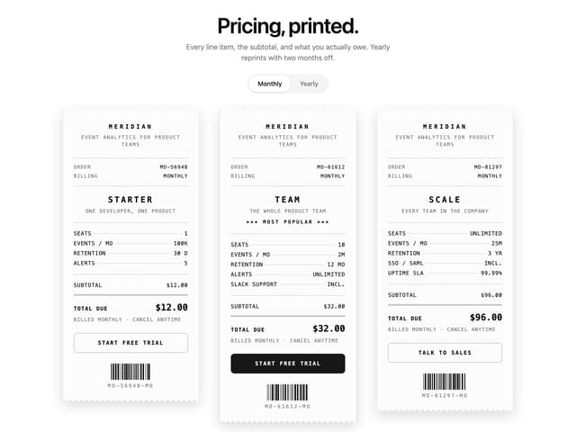
Receipt Pricing
161
Import Patchbay
129
Lookout
87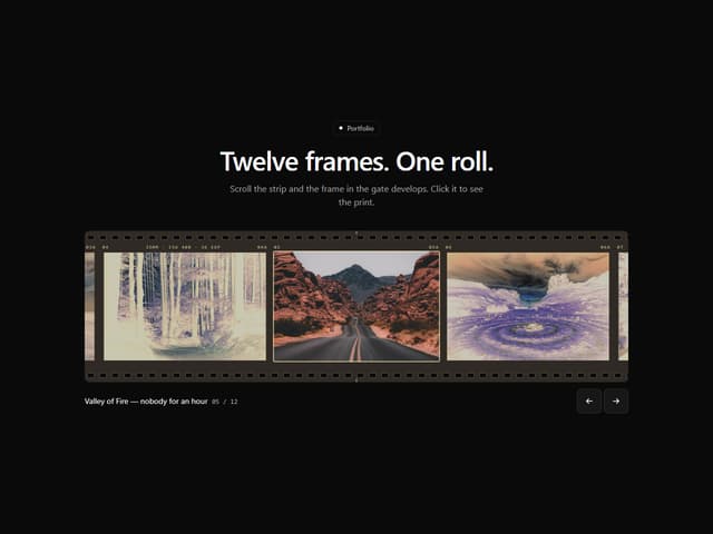
Filmstrip Gallery
62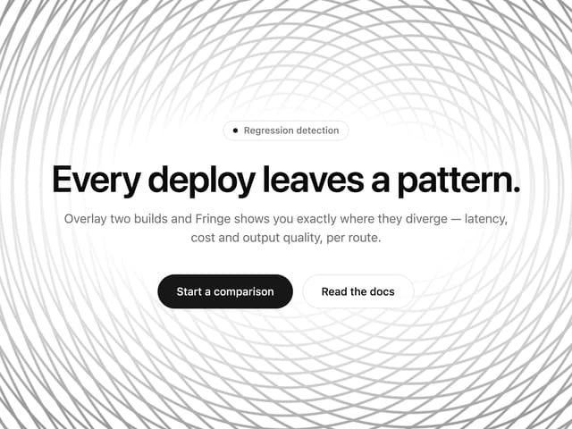
Moiré Field
32
Meridian Rail
2
Split Flap Button
1
More in Heroes
View all

SaaS Template
2.5K

Hero
1.3K

Responsive Hero Banner
2K
Centered Hero with Image Fan
968
Editorial Collage Hero
458

Minimalist Hero Fashion
296
Glass Fold
278

Aero Hero-3
576
