
About
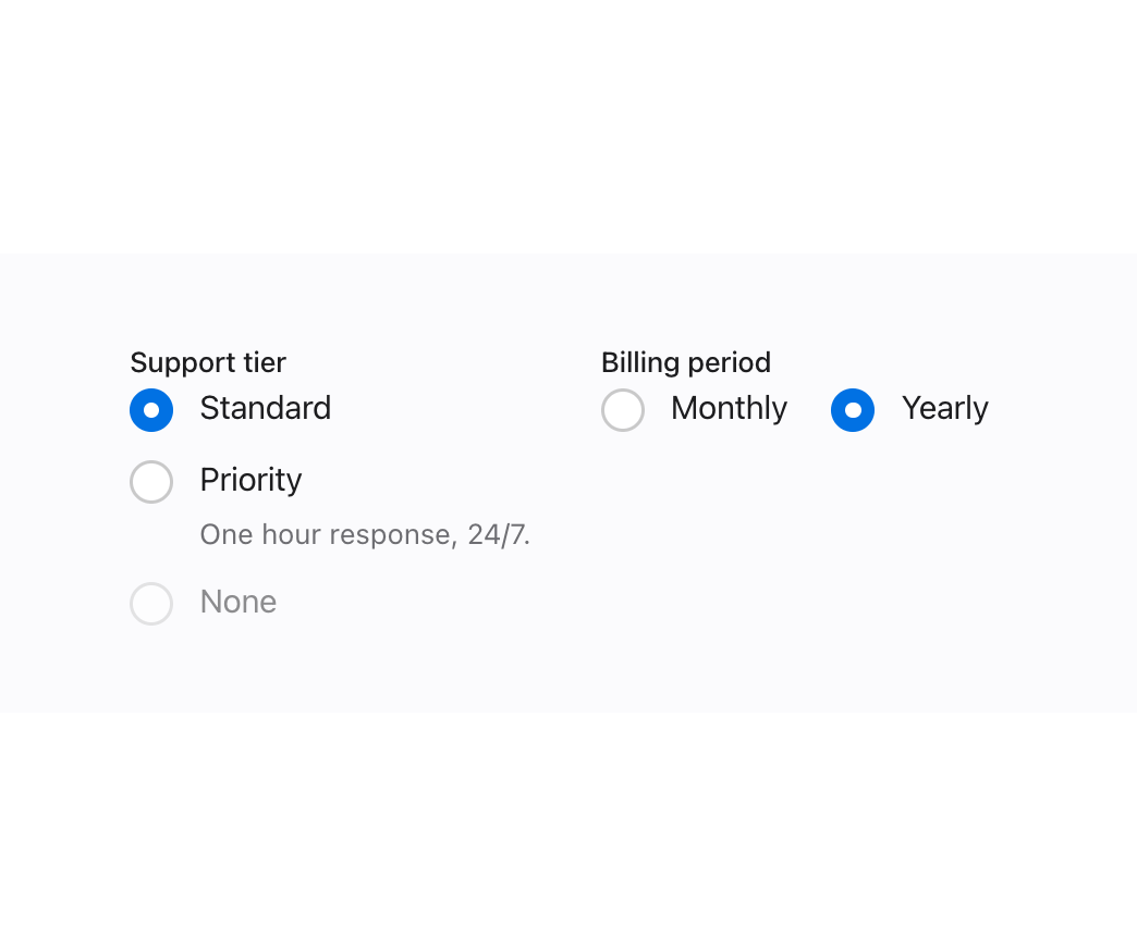
A set of accessible native-input toggle controls — checkbox, radio/radio group, and switch — sharing one label/description/error layout for settings and forms.
Built with React and Tailwind. Copy the prompt and paste it into Claude Code, Cursor or Lovable: your agent adds Toggles to your project and fits it to your theme.
Code
How Toggles is used: the demo's code. The component's own source comes with a free account.
Usage.tsx
import { Radio, RadioGroup } from "@/components/ui/toggles";

export default function RadioGroupDemo() {
  return (
    <div
      className="mors-scope flex w-full items-center justify-center p-10"
      style={{ background: "var(--mors-color-canvas)" }}
    >
      <div className="flex w-full max-w-xl flex-wrap gap-8">
        <RadioGroup name="tier" legend="Support tier">
          <Radio value="standard" label="Standard" defaultChecked />
          <Radio
            value="priority"
            label="Priority"
            description="One hour response, 24/7."
          />
          <Radio value="none" label="None" disabled />
        </RadioGroup>
        <RadioGroup
          name="billing"
          legend="Billing period"
          orientation="horizontal"
        >
          <Radio value="monthly" label="Monthly" defaultChecked />
          <Radio value="yearly" label="Yearly" />
        </RadioGroup>
      </div>
    </div>
  );
}
More by murad-sinatra
View all
Event Calendar
3
Table
2
Command Palette
1
Drawer
1
Number Field
1
Tooltip
Popover
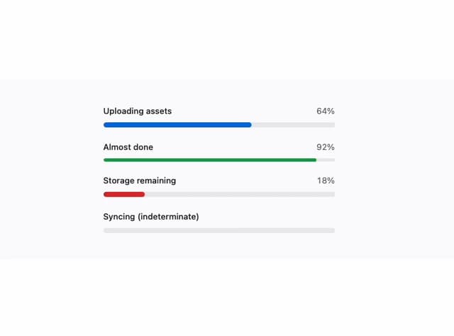
Loaders
More in Forms
View all

Premium Auth
524

Contact Card
1K

Book A Demo 1
73

Login 1
53

Form
137

Card Studio
41
SignInPage
667

Modern & Stunning sign in
1.6K
