

About
A set of loading indicators — a spinner for short indeterminate waits, skeleton placeholders for content whose shape is known, and a progress bar for measurable completion.
Built with React and Tailwind. Copy the prompt and paste it into Claude Code, Cursor or Lovable: your agent adds Loaders to your project and fits it to your theme.
Code
How Loaders is used: the demo's code. The component's own source comes with a free account.
Usage.tsx
import { Skeleton } from "@/components/ui/loaders";

export default function SkeletonLoadingCardDemo() {
  return (
    <div
      className="flex w-full items-center justify-center p-10"
      style={{
        background: "var(--mors-color-canvas)",
        color: "var(--mors-color-text)",
      }}
    >
      <div className="mors-card mors-card--raised" style={{ width: 320 }}>
        <div className="mors-card-header">
          <div className="mors-card-heading">
            <h3 className="mors-card-title">Loading card</h3>
          </div>
        </div>
        <div className="mors-card-body">
          <div
            style={{
              display: "flex",
              flexDirection: "column",
              gap: "var(--mors-space-4)",
            }}
          >
            <div
              style={{
                display: "flex",
                alignItems: "center",
                gap: "var(--mors-space-4)",
              }}
            >
              <Skeleton variant="circle" width={40} height={40} />
              <Skeleton variant="text" width="8rem" />
            </div>
            <Skeleton variant="text" lines={3} />
            <Skeleton variant="rect" height={80} />
          </div>
        </div>
      </div>
    </div>
  );
}
More by murad-sinatra
View all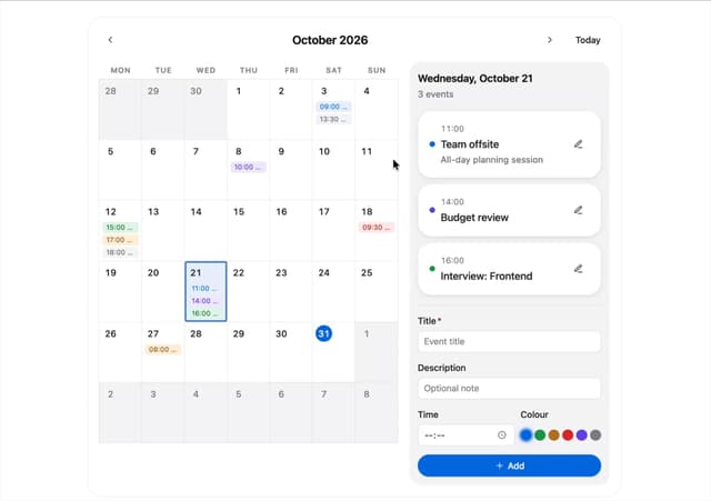
Event Calendar
3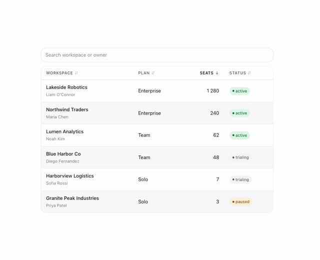
Table
2
Command Palette
1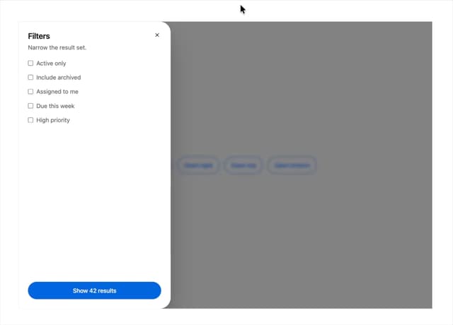
Drawer
1
Toggles
1
Number Field
1
Tooltip
Popover
More in Cards
View all

Course Design Cards
1.1K

Statistics Card 7
301
Statistics Card 2
272
Stats cards with links
82

Interactive Tech Stack Bento Grid with Hover Effects
183

Card Studio
35
Card
70

Card
18
