
About
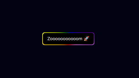
The Gradient Button component is a stylised React button (part of the Nurui UI library) designed for modern UIs. It features an animated, rainbow-gradient border, supports accessibility, and has props for customizing border width, colors, animation duration, border radius, blur amount, button background colour, text content, and additional CSS classes.
Built with React and Tailwind. Copy the prompt and paste it into Claude Code, Cursor or Lovable: your agent adds gradient button to your project and fits it to your theme.
Code
How gradient button is used: the demo's code. The component's own source comes with a free account.
Usage.tsx
import React from "react";
import GradientButton from "@/components/ui/gradient-button";

const GradientButtonDemo = () => {
  return (
    <div className="flex items-center justify-center min-h-screen">
      <GradientButton />
    </div>
  );
};

export default GradientButtonDemo;
More by Md afsar mahmud
View all

Hover Footer
1.3K
banner
344
counter loader
269
tech-curosr
181
gradient text
13
gradient hero
glowing card
More in Buttons
View all
Texture Button
97

Button
5

Button Group


Eclipse Button
39
Button
4

HeroUI Button Group


App Store Button
458
Base Button
4

