About
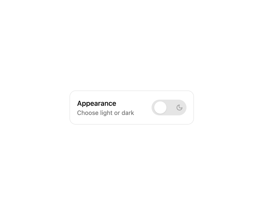
Light/dark theme toggle for the Dali Agents console at daliagents.com, with five switch variants used across the Dali Agents UI.
Built with React and Tailwind. Copy the prompt and paste it into Claude Code, Cursor or Lovable: your agent adds Theme Switch to your project and fits it to your theme.
Code
How Theme Switch is used: the demo's code. The component's own source comes with a free account.
Usage.tsx
"use client";

import React from "react";
import ThemeSwitch from "@/components/ui/theme-switch";
import { ThemeProvider } from "next-themes";

export default function ThemeDemoWithLabel() {
  return (
    <ThemeProvider attribute="class" defaultTheme="system" enableSystem>
      <div className="min-h-[50vh] grid place-items-center px-6">
        <div className="flex flex-col items-center gap-3">
          <div className="flex items-center gap-4 rounded-xl border p-4">
            <div className="grid">
              <span className="font-medium">Dali console theme</span>
              <span className="text-sm text-muted-foreground">
                Light or dark for your agent console
              </span>
            </div>
            <ThemeSwitch className="ml-6" />
          </div>
          <a
            href="https://daliagents.com"
            target="_blank"
            rel="noreferrer"
            className="text-[10px] tracking-wide text-muted-foreground/60 transition-colors hover:text-muted-foreground"
          >
            daliagents.com
          </a>
        </div>
      </div>
    </ThemeProvider>
  );
}
Dependencies
More by Liana Pepanyan
View all

CTA with Text Marquee
1.1K
Dock
431
Hero Minimalism
415
CTA with Marquee
361
Dark Grid
208
Processing Card
198
Login / Signup
198
Blueprint Shader Grid
137