
About
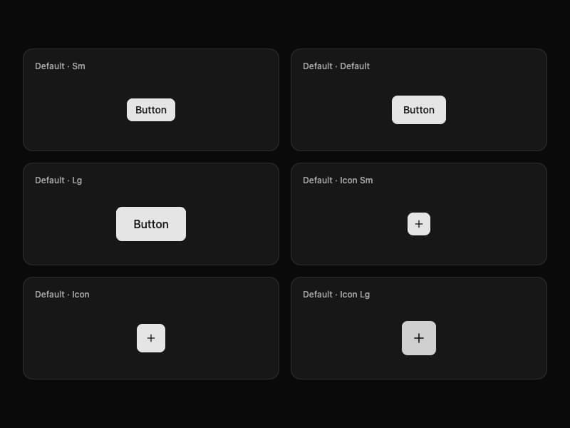
A versatile button component from Interfaces DS with six visual variants and six size combinations per variant.
Built with React and Tailwind. Copy the prompt and paste it into Claude Code, Cursor or Lovable: your agent adds Interfaces Button to your project and fits it to your theme.
Code
How Interfaces Button is used: the demo's code. The component's own source comes with a free account.
Usage.tsx
"use client"

import { Plus } from "lucide-react"

import { Button } from "@/components/ui/interfaces-button"

const sizes = [
  { label: "Default · Sm", size: "sm" as const },
  { label: "Default · Default", size: "default" as const },
  { label: "Default · Lg", size: "lg" as const },
  { label: "Default · Icon Sm", size: "icon-sm" as const, icon: true },
  { label: "Default · Icon", size: "icon" as const, icon: true },
  { label: "Default · Icon Lg", size: "icon-lg" as const, icon: true },
]

export default function ButtonDefaultDemo() {
  return (
    <div className="flex w-full min-h-screen items-center justify-center overflow-hidden bg-background p-8">
      <div className="grid w-full max-w-5xl gap-4 sm:grid-cols-2 lg:grid-cols-3">
        {sizes.map((item) => (
          <div
            key={item.label}
            className="flex min-h-36 flex-col rounded-xl border bg-card p-4 shadow-sm"
          >
            <p className="text-xs font-medium text-muted-foreground">{item.label}</p>
            <div className="flex flex-1 items-center justify-center pt-3">
              <Button size={item.size} aria-label={item.icon ? item.label.toLowerCase() : undefined}>
                {item.icon ? <Plus className="size-4" /> : "Button"}
              </Button>
            </div>
          </div>
        ))}
      </div>
    </div>
  )
}
Dependencies
More by jshguo
View all

Progress
427
Select
372
Textarea
259
Input OTP
161
Interfaces Carousel
160
Switch
138
Hover Card
110
Card
85
More in Buttons
View all
Texture Button
97

Button
5

Button Group


Eclipse Button
39
Button
4

HeroUI Button Group


App Store Button
458
Base Button
4

