
About
Multi-line form textarea with brand-red focus ring. Forwards all native textarea props and uses focus-visible for accessible keyboard focus. Min-height 120px, full width by default.
Built with React and Tailwind. Copy the prompt and paste it into Claude Code, Cursor or Lovable: your agent adds Textarea to your project and fits it to your theme.
Code
How Textarea is used: the demo's code. The component's own source comes with a free account.
Usage.tsx
import Textarea from '@/components/ui/textarea'

export default function Demo() {
  return (
    <div className="p-8 bg-slate-50 max-w-2xl">
      <Textarea placeholder="Vertel ons over uw project — bijvoorbeeld de gewenste werkzaamheden, oppervlakte en timing." rows={6} />
    </div>
  )
}
Dependencies
More by Jason Mohab-Ali
View all

Alqemist Interactive Demo
10
Qreatify Super Agent Card
5
Alqemist Security
4
Alqemist Hero
4
Alqemist How It Works
3
Alqemist Cta
2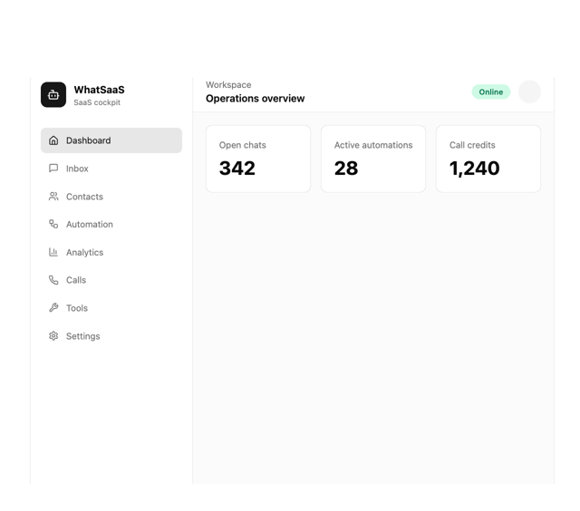
What Saa SApp Shell
2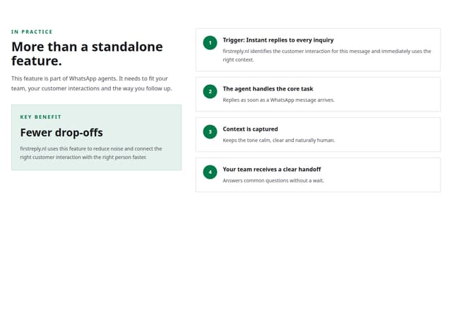
FirstReply Product Detail flow
More in Forms
View all

Premium Auth
524

Contact Card
1K

Book A Demo 1
73

Login 1
53

Form
137

Card Studio
41

Modern & Stunning sign in
1.6K
SignInPage
667
