
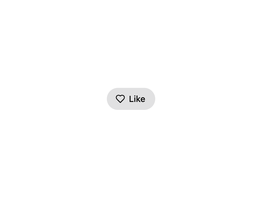
HeroUI v3 ToggleButton — a two-state button that stays pressed/selected when toggled, for like, bookmark, mute and similar on/off actions. Supports default and ghost variants, sm/md/lg sizes, icon-only mode, controlled selection via isSelected/onChange, render-prop children for per-state content, and disabled state, with full React Aria toggle semantics and accessibility. A thin re-export of the genuine @heroui/react package with @heroui/styles, so consumers install and render the real HeroUI primitive.
Built with React and Tailwind. Copy the prompt and paste it into Claude Code, Cursor or Lovable: your agent adds HeroUI Toggle Button to your project and fits it to your theme.
Code
How HeroUI Toggle Button is used: the demo's code. The component's own source comes with a free account.
Usage.tsx
"use client"

import { Heart } from "lucide-react"
import { ToggleButton } from "@/components/ui/heroui-toggle-button"

export default function Default() {
  return (
    <ToggleButton>
      <Heart />
      Like
    </ToggleButton>
  )
}
Dependencies
More by Hero Ui
View all

DatePicker
467
Chip
442
The Pagination
361
HeroUI Color Picker
107
HeroUI Table
106
Skeleton
105
HeroUI Disclosure Group
94
HeroUI AlertDialog
80
More in Buttons
View all
Texture Button
97

Button
5

Button Group


Eclipse Button
39
Button
4
HeroUI Button Group


App Store Button
458
Base Button
4

