
About
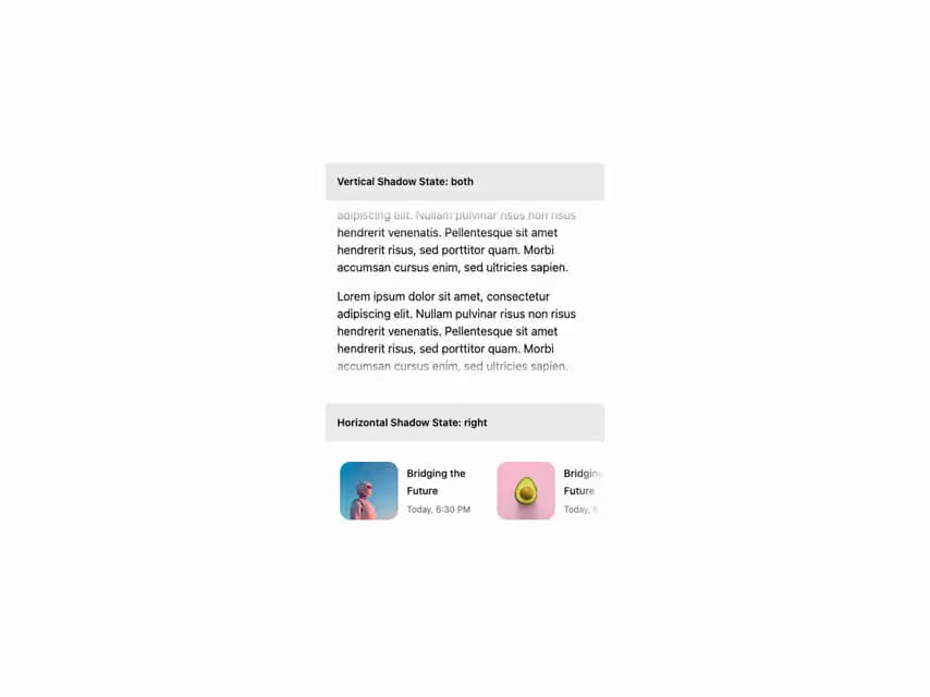
HeroUI v3 ScrollShadow — adds a fade/shadow to scrollable overflow containers, with orientation, hidden scrollbar, custom shadow size, visibility change and card usage.
Built with React and Tailwind. Copy the prompt and paste it into Claude Code, Cursor or Lovable: your agent adds HeroUI Scroll Shadow to your project and fits it to your theme.
Code
How HeroUI Scroll Shadow is used: the demo's code. The component's own source comes with a free account.
Usage.tsx
"use client"

import type { ScrollShadowVisibility } from "@/components/ui/heroui-scroll-shadow"

import { ScrollShadow } from "@/components/ui/heroui-scroll-shadow"
import { Card } from "@heroui/react"
import { useState } from "react"

const images = [
  "https://cdn.21st.dev/assets/mirror/5b/5b15046d3c27c20dd79bd5426e7fbaf7173c9cc3554455fa115767bd3c289a15.jpg",
  "https://cdn.21st.dev/assets/mirror/8a/8a5b6d3605778d2a4e3b258347bb8a07f0797f5f2734c18a1cf82a98545e6103.jpg",
  "https://cdn.21st.dev/assets/mirror/84/84c1e83131d0e84371fe9ccec959d2926ab1d91167e8f4d619f9f5f8e1e2eb80.jpg",
]

export default function VisibilityChange() {
  const [verticalState, setVerticalState] = useState<ScrollShadowVisibility>("none")
  const [horizontalState, setHorizontalState] = useState<ScrollShadowVisibility>("none")

  const getRandomImage = (idx: number) => {
    return images[idx % images.length]
  }

  return (
    <div className="w-full sm:max-w-sm">
      <div className="mb-8 flex flex-col gap-2">
        <div className="rounded bg-default p-4">
          <p className="text-sm font-semibold">Vertical Shadow State: {verticalState}</p>
        </div>
        <div className="w-full">
          <ScrollShadow
            className="max-h-[240px] p-4"
            orientation="vertical"
            onVisibilityChange={(visibility) => setVerticalState(visibility)}
          >
            <div className="space-y-4">
              {Array.from({ length: 10 }).map((_, idx) => (
                <p key={`scroll-shadow-lorem-content-${idx}`}>
                  Lorem ipsum dolor sit amet, consectetur adipiscing elit. Nullam pulvinar risus non
                  risus hendrerit venenatis. Pellentesque sit amet hendrerit risus, sed porttitor
                  quam. Morbi accumsan cursus enim, sed ultricies sapien.
                </p>
              ))}
            </div>
          </ScrollShadow>
        </div>
      </div>

      <div className="flex flex-col gap-2">
        <div className="rounded bg-default p-4">
          <p className="text-sm font-semibold">Horizontal Shadow State: {horizontalState}</p>
        </div>
        <div className="w-full">
          <ScrollShadow
            className="p-4"
            orientation="horizontal"
            onVisibilityChange={(visibility) => setHorizontalState(visibility)}
          >
            <div className="flex flex-row gap-4">
              {Array.from({ length: 10 }).map((_, idx) => (
                <Card
                  key={`scroll-shadow-lorem-cards-${idx}`}
                  className="flex min-w-[200px] flex-row gap-3 p-1"
                  variant="transparent"
                >
                  <img
                    alt="Lorem Card"
                    className="aspect-square h-16 w-16 shrink-0 rounded-xl object-cover select-none sm:h-20 sm:w-20"
                    loading="lazy"
                    src={getRandomImage(idx)}
                  />
                  <div className="flex flex-1 flex-col justify-center gap-1">
                    <Card.Title className="text-sm">Bridging the Future</Card.Title>
                    <Card.Description className="text-xs">Today, 6:30 PM</Card.Description>
                  </div>
                </Card>
              ))}
            </div>
          </ScrollShadow>
        </div>
      </div>
    </div>
  )
}
Dependencies
More by Hero Ui
View all

DatePicker
467
Chip
442
The Pagination
361
HeroUI Color Picker
107
HeroUI Table
106
Skeleton
105
HeroUI Disclosure Group
94
HeroUI AlertDialog
80
More in Cards
View all

Course Design Cards
1.1K

Statistics Card 7
301
Statistics Card 2
272
Stats cards with links
82

Interactive Tech Stack Bento Grid with Hover Effects
183

Card Studio
35
Card
70

Card
18
