
About
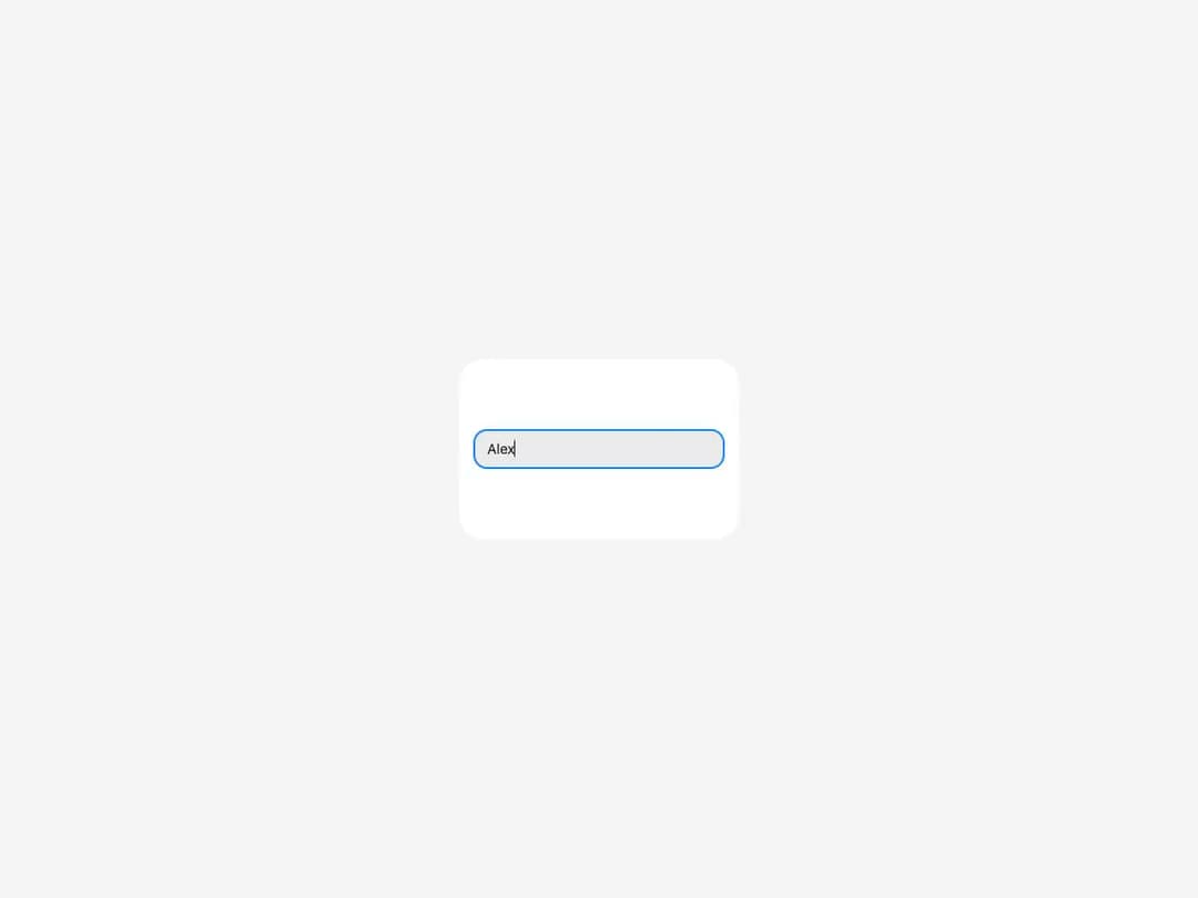
Primitive single-line text input that accepts standard HTML attributes.
Built with React and Tailwind. Copy the prompt and paste it into Claude Code, Cursor or Lovable: your agent adds Input to your project and fits it to your theme.
Code
How Input is used: the demo's code. The component's own source comes with a free account.
Usage.tsx
import { Input, Surface } from "@/components/ui/heroui-input"

export default function Demo() {
  return (
    <Surface className="flex h-[180px] w-[280px] items-center justify-center rounded-3xl bg-surface p-4">
      <Input className="w-full" placeholder="Your name" variant="secondary" />
    </Surface>
  )
}
Dependencies
More by Hero Ui
View all

DatePicker
467
Chip
442
The Pagination
361
HeroUI Color Picker
107
HeroUI Table
106
Skeleton
105
HeroUI Disclosure Group
94
HeroUI AlertDialog
80
More in Forms
View all

Premium Auth
524

Contact Card
1K

Book A Demo 1
73

Form
16

Login 1
53
Book A Demo 3
89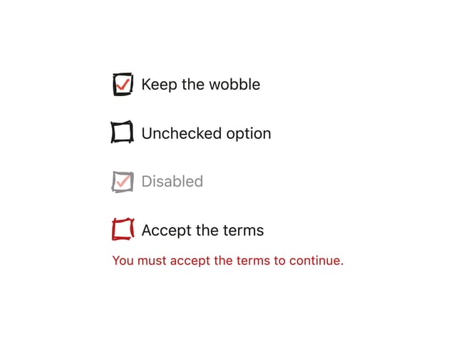
Hand-Drawn Checkbox
48
Login Card
6

