
About
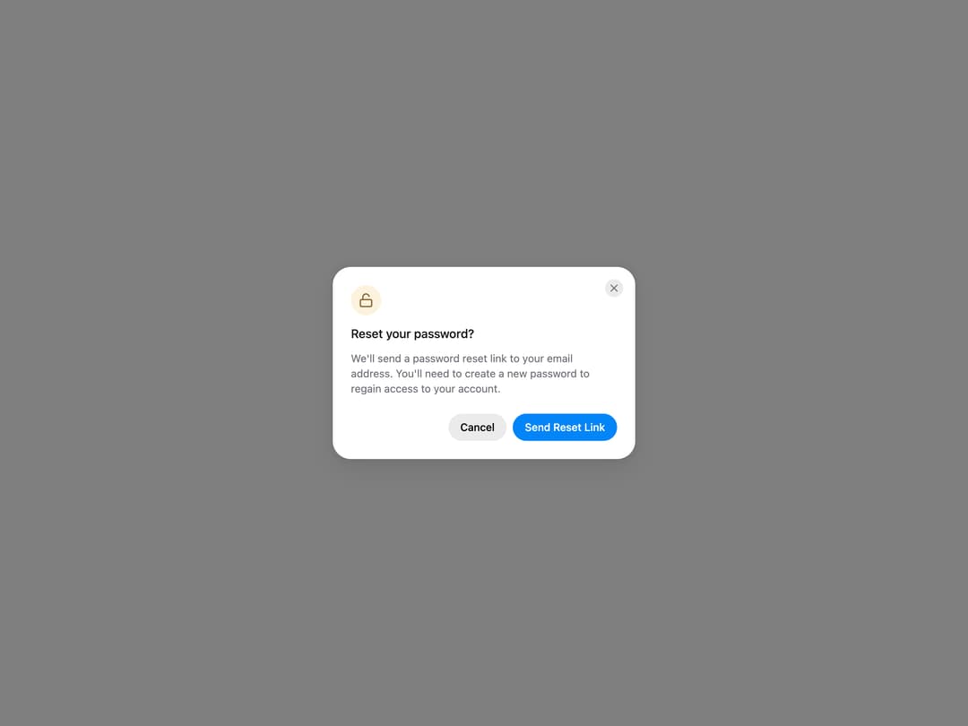
HeroUI AlertDialog for critical confirmations, with status icons, placements, backdrop variants, sizes, custom icons, dismiss behavior, controlled state and custom trigger examples. Uses the real @heroui/react component with bundled @heroui/styles CSS.
Built with React and Tailwind. Copy the prompt and paste it into Claude Code, Cursor or Lovable: your agent adds HeroUI AlertDialog to your project and fits it to your theme.
Code
How HeroUI AlertDialog is used: the demo's code. The component's own source comes with a free account.
Usage.tsx
"use client"

import { AlertDialog } from "@/components/ui/heroui-alert-dialog"
import { Button } from "@heroui/react"
import { LockOpen } from "lucide-react"

export default function CustomIcon() {
  return (
    <AlertDialog>
      <Button variant="secondary">Reset Password</Button>
      <AlertDialog.Backdrop>
        <AlertDialog.Container>
          <AlertDialog.Dialog className="sm:max-w-[400px]">
            <AlertDialog.CloseTrigger />
            <AlertDialog.Header>
              <AlertDialog.Icon status="warning"><LockOpen className="size-5" /></AlertDialog.Icon>
              <AlertDialog.Heading>Reset your password?</AlertDialog.Heading>
            </AlertDialog.Header>
            <AlertDialog.Body>
              <p>We'll send a password reset link to your email address. You'll need to create a new password to regain access to your account.</p>
            </AlertDialog.Body>
            <AlertDialog.Footer>
              <Button slot="close" variant="tertiary">Cancel</Button>
              <Button slot="close">Send Reset Link</Button>
            </AlertDialog.Footer>
          </AlertDialog.Dialog>
        </AlertDialog.Container>
      </AlertDialog.Backdrop>
    </AlertDialog>
  )
}
Dependencies
More by Hero Ui
View all

DatePicker
467
Chip
442
The Pagination
361
HeroUI Color Picker
107
HeroUI Table
106
Skeleton
105
HeroUI Disclosure Group
94
ComboBox
75