
About
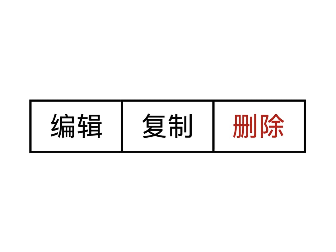
A container that visually joins a row (or stack) of buttons into one shared-outline group, collapsing the border between adjacent buttons; ported to React from hemingtsai's Zemponet Vue component library (MIT), credit to the original author.
Built with React and Tailwind. Copy the prompt and paste it into Claude Code, Cursor or Lovable: your agent adds Button Group to your project and fits it to your theme.
Code
How Button Group is used: the demo's code. The component's own source comes with a free account.
Usage.tsx
import ZButton from "@/components/ui/z-button-group-utils/z-button";
import ZButtonGroup from "@/components/ui/z-button-group";

export default function ZButtonGroupDemo() {
  return (
    <div className="flex items-center justify-center p-10">
      <ZButtonGroup>
        <ZButton size="sm">编辑</ZButton>
        <ZButton size="sm">复制</ZButton>
        <ZButton size="sm" variant="danger">
          删除
        </ZButton>
      </ZButtonGroup>
    </div>
  );
}
More by hemingtsai
View all
ZCheckbox
Floating Action Button
More in Buttons
View all

Button
5
Texture Button
97

Button Group


Eclipse Button
39
Button
4

HeroUI Button Group

Base Button
4

App Store Button
458

