
About
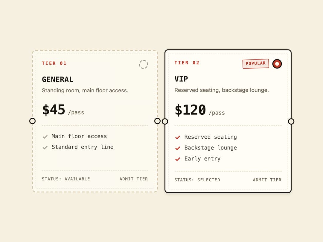
A selectable group of ticket-stub styled cards (with title, price, perks and a sold-out state) used for choosing a single pricing tier or plan.
Built with React and Tailwind. Copy the prompt and paste it into Claude Code, Cursor or Lovable: your agent adds Radio Cards to your project and fits it to your theme.
Code
How Radio Cards is used: the demo's code. The component's own source comes with a free account.
Usage.tsx
"use client";

import { RadioCards, RadioCard } from "@/components/ui/radio-cards";

export default function RadioCardsDemo() {
  return (
    <div className="flex min-h-screen w-full items-center justify-center bg-background p-8">
      <RadioCards defaultValue="vip" columns={2} className="w-full max-w-xl">
        <RadioCard
          value="std"
          tier="Tier 01"
          title="General"
          subtitle="Standing room, main floor access."
          price="$45"
          perks={["Main floor access", "Standard entry line"]}
        />
        <RadioCard
          value="vip"
          tier="Tier 02"
          title="VIP"
          subtitle="Reserved seating, backstage lounge."
          price="$120"
          badge="Popular"
          perks={["Reserved seating", "Backstage lounge", "Early entry"]}
        />
      </RadioCards>
    </div>
  );
}
More by f0rextasy
View all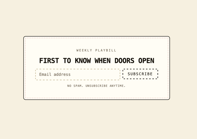
Newsletter Signup Card
10
Stamp Seal
7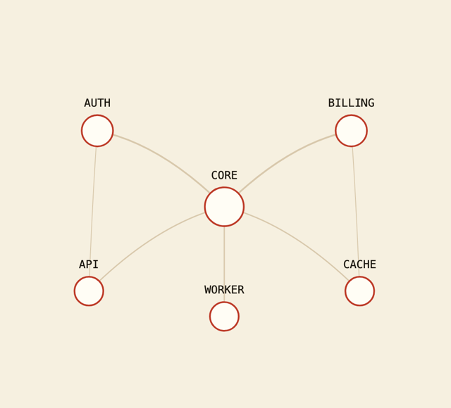
Network Graph
7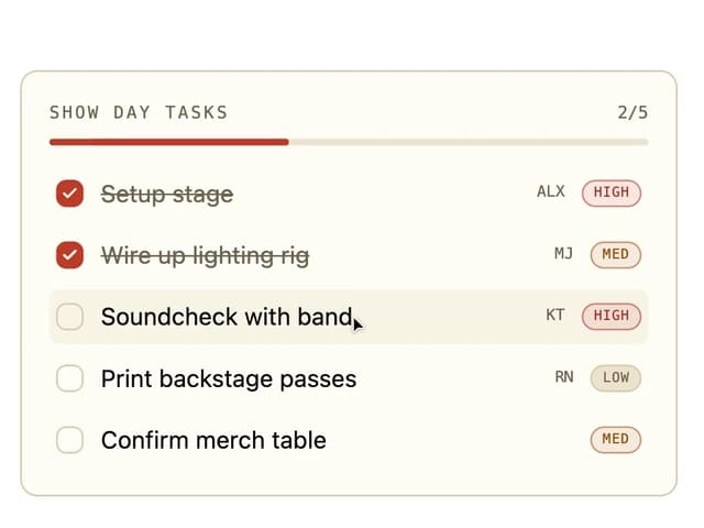
Board Checklist
5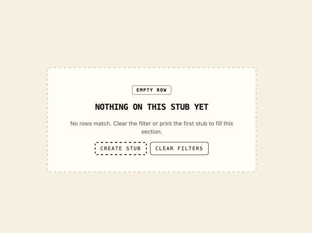
Empty State Card
3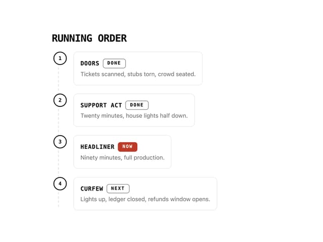
Running Order Timeline
3
Invite Modal
3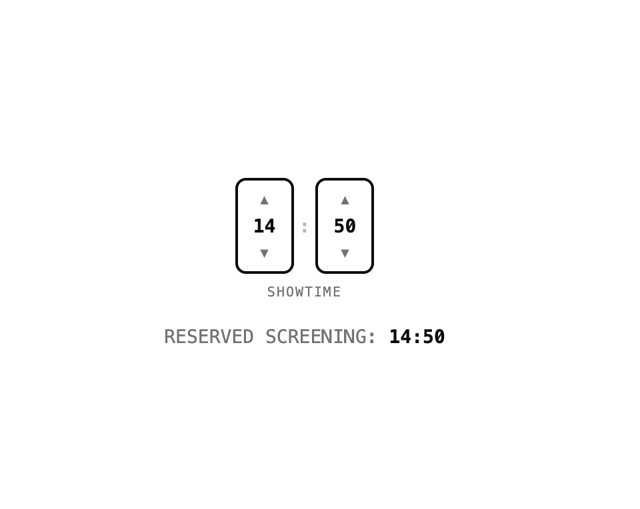
Time Input
3
More in Pricing
View all
Pricing Section
606
pricing section
166

Pricing Section
180

Pricing Card
372

RuixenPricing05
103

Pricing Cards
17

Boxly Pricing-1
90
Colorful-Pricing
86


