
About
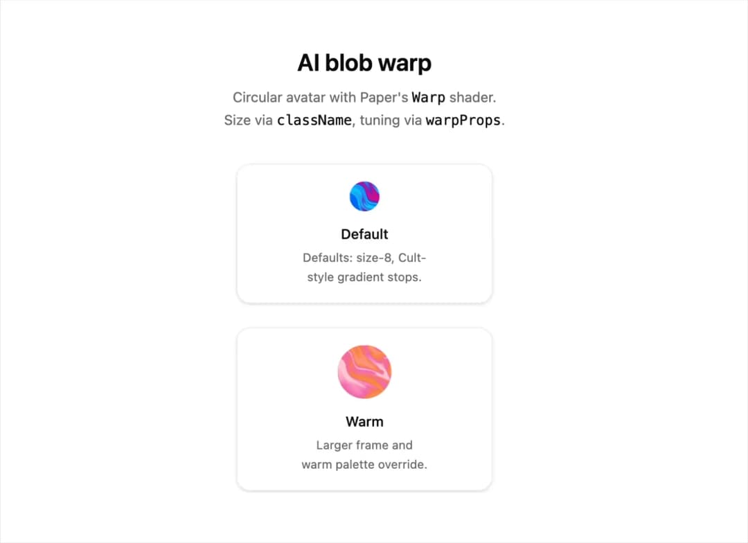
A small circular avatar that animates an organic, colorful warp/blob shader inside it, useful as an AI assistant or loading indicator icon that pulses gently and pauses when off-screen or reduced motion is preferred.
Built with React and Tailwind. Copy the prompt and paste it into Claude Code, Cursor or Lovable: your agent adds AI Blob Warp Avatar to your project and fits it to your theme.
Code
How AI Blob Warp Avatar is used: the demo's code. The component's own source comes with a free account.
Usage.tsx
"use client";
import type { ReactNode } from "react";
import { AiBlobWarpAvatar } from "@/components/ui/ai-blob-warp";
function SampleCard({
label,
description,
children,
}: {
label: string;
description: string;
children: ReactNode;
}) {
return (
<div className="flex flex-col items-center gap-3 rounded-xl border border-border/60 bg-card/40 p-4 text-center shadow-sm">
{children}
<div className="space-y-1">
<p className="font-medium text-foreground text-sm">{label}</p>
<p className="max-w-56 text-balance text-muted-foreground text-xs leading-relaxed">
{description}
</p>
</div>
</div>
);
}
export default function AiBlobWarpDemo() {
return (
<div className="mx-auto max-w-lg space-y-8 px-4 py-10 sm:py-14">
<div className="text-center">
<h1 className="mb-2 font-semibold text-2xl text-foreground">
AI blob warp
</h1>
<p className="text-balance text-muted-foreground text-sm leading-relaxed">
Circular avatar with Paper's{" "}
<code className="text-foreground">Warp</code> shader. Size via{" "}
<code className="text-foreground">className</code>, tuning via{" "}
<code className="text-foreground">warpProps</code>.
</p>
</div>
<div className="flex flex-wrap justify-center gap-6">
<SampleCard
description="Defaults: size-8, Cult-style gradient stops."
label="Default"
>
<AiBlobWarpAvatar aria-label="Default warp avatar" />
</SampleCard>
<SampleCard
description="Larger frame and warm palette override."
label="Warm"
>
<AiBlobWarpAvatar
aria-label="Warm warp avatar"
className="size-14"
warpProps={{
colors: ["#fda4af", "#fb923c", "#f472b6", "#fecdd3"],
}}
/>
</SampleCard>
</div>
</div>
);
}
Dependencies
More by cult/ui
View all
3D Carousel
2.5K
Logo Carousel
1.1K
Feature Carousel
510
Popover Form
420
Floating Panel
250
Expandable
131
Dock
120
Hero Liquid Metal
106
More in Shaders
View all
Glass Fold
278

Phosphor 30
293

Shader Animation
3.7K
Wave
693
Black Hole
27
Shader Background
2K
Shader Lines
2.3K
Liquid Glass Logo Reveal
628


