
About
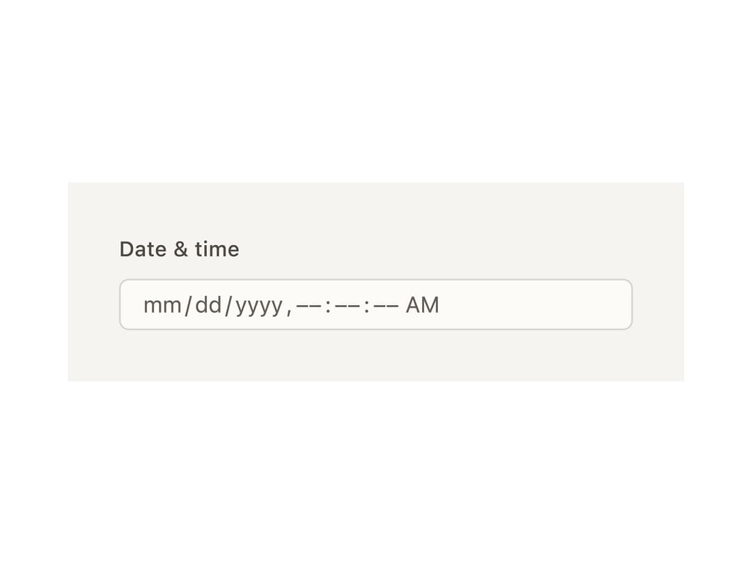
A segmented date (and optional time) input where each part of the date — month, day, year, hour — is its own arrow-navigable, typeable segment inside one field.
Built with React and Tailwind. Copy the prompt and paste it into Claude Code, Cursor or Lovable: your agent adds Date Input to your project and fits it to your theme.
Code
How Date Input is used: the demo's code. The component's own source comes with a free account.
Usage.tsx
import { DateInput } from "@/components/ui/date-input";
export default function DateInputGranularityDemo() {
return (
<div
className="flex w-full max-w-sm items-center justify-center p-8"
style={{ background: "var(--bs-color-surface-0, var(--background))" }}
>
<DateInput.Root granularity="second">
<DateInput.Label>Date & time</DateInput.Label>
<DateInput.Control>
<DateInput.SegmentGroup>
<DateInput.SegmentContext>
{(segment) => <DateInput.Segment segment={segment} />}
</DateInput.SegmentContext>
</DateInput.SegmentGroup>
</DateInput.Control>
<DateInput.HiddenInput />
</DateInput.Root>
</div>
);
}
Dependencies
More by bysages
View all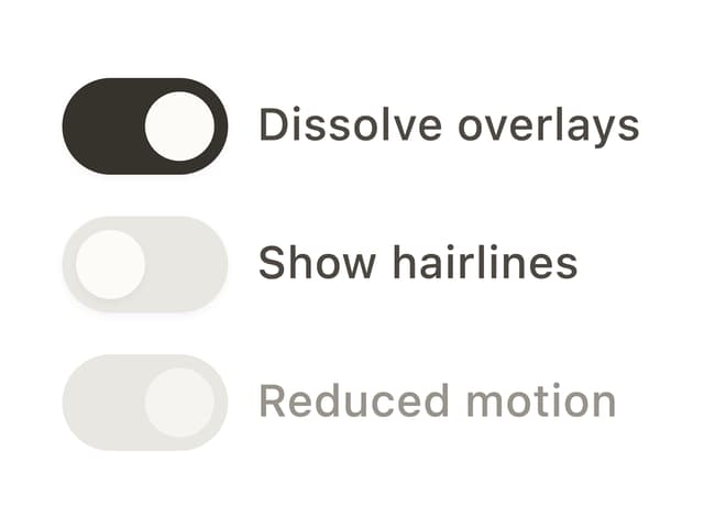
Switch
15
Avatar Group
7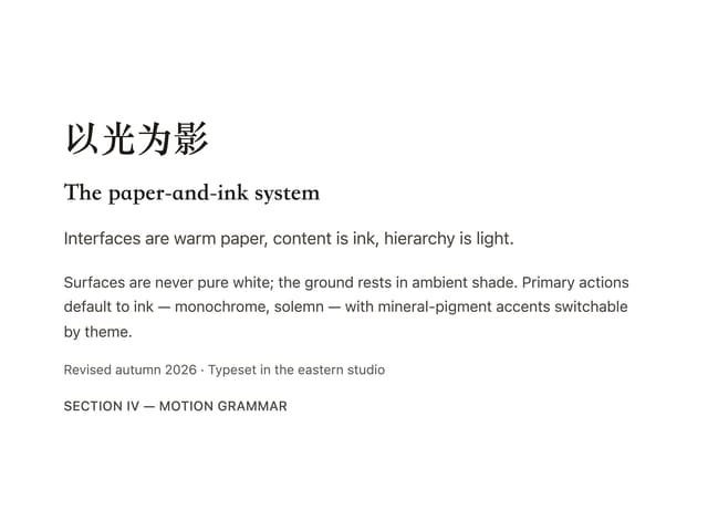
Typography
6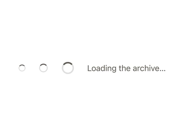
Spinner
4
Grid
Float Button
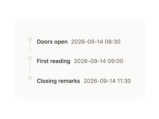
Timeline

Floating Panel
More in Forms
View all

Premium Auth
524

Contact Card
1K

Book A Demo 1
73

Login 1
53

Form
137

Card Studio
41

Modern & Stunning sign in
1.6K
SignInPage
667
