About
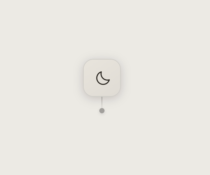
A dark/light mode toggle styled as a window-blind pull cord, where clicking swings a cord to flip venetian-blind slats revealing the sun or moon icon.
Built with React and Tailwind. Copy the prompt and paste it into Claude Code, Cursor or Lovable: your agent adds Blind Pull Toggle to your project and fits it to your theme.
Code
How Blind Pull Toggle is used: the demo's code. The component's own source comes with a free account.
Usage.tsx
import BlindPullToggle from "@/components/ui/blind-pull-toggle";

export default function BlindPullToggleDemo() {
  return (
    <div className="flex h-screen w-full items-center justify-center">
      <BlindPullToggle />
    </div>
  );
}
Dependencies
More by aicanvas
View all

Expanding Tabs
134
Stack Tower
97
Runway Loader
95
Magnetic Logo Cluster
14
Search Field
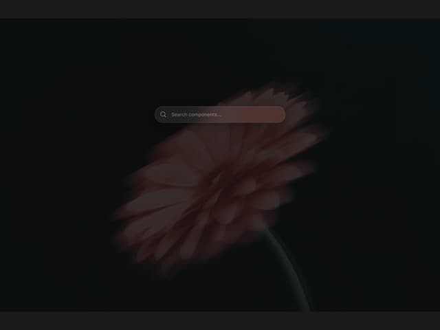
Glass Search Bar
More in Buttons
View all

Button
5
Texture Button
97

Button Group


Eclipse Button
39
Button
4

HeroUI Button Group

Base Button
4

App Store Button
458

