

About
A WCAG-compliant tooltip that shows contextual help text on hover or keyboard focus, with ARIA aria-describedby wiring, Escape-to-dismiss, hoverable persistence, and automatic edge-clamping. Ported from A11YPros' accessible a11y-tooltip web component (MIT licensed).
Built with React and Tailwind. Copy the prompt and paste it into Claude Code, Cursor or Lovable: your agent adds Accessible Tooltip to your project and fits it to your theme.
Code
How Accessible Tooltip is used: the demo's code. The component's own source comes with a free account.
Usage.tsx
import Tooltip from "@/components/ui/a11y-tooltip";

export default function TooltipSmallDemo() {
  return (
    <div style={{ display: "flex", justifyContent: "center", padding: "4rem" }}>
      <Tooltip
        isSmall
        placement="right"
        content="Compact 0.75rem copy"
        defaultIcon="help"
        label="Quick helper"
      />
    </div>
  );
}
More by a11ypros
View all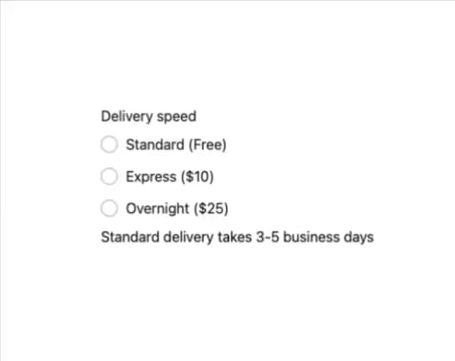
Accessible Radio Group
1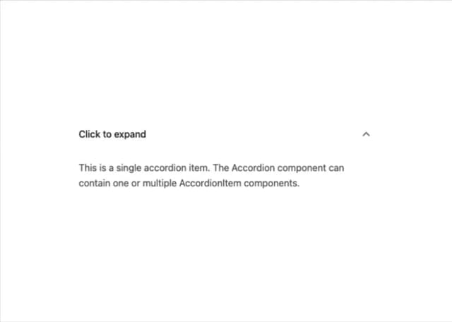
Accessible Accordion
1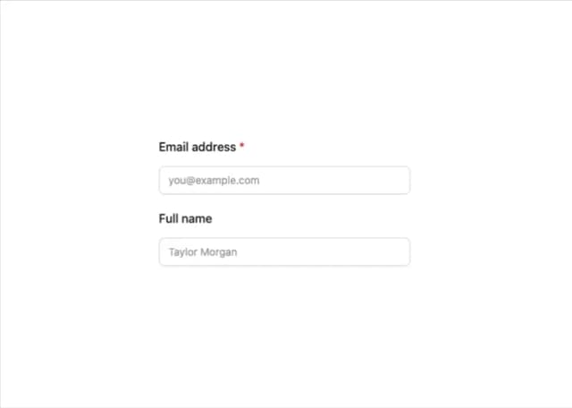
A11y Label
More in Buttons
View all
Texture Button
97

Button
5

Button Group


Eclipse Button
39
Button
4

HeroUI Button Group


App Store Button
458
Base Button
4

